PBSAP Investment Platform
A digital platform that connects investors, organizations, and communities to fund and support biodiversity conservation initiatives across the Philippines.
The problem, the goal, and what success looks like
Environmental initiatives and investment opportunities involve large amounts of information that are difficult to understand and navigate.
Create a platform that helps users explore projects, understand opportunities, and participate with minimal friction.
Success criteria
- Improve content discoverability
- Reduce navigation complexity
- Present data in a clearer format
- Support easier decision making
- Create a consistent experience
Information density
Large amounts of content needed organizing without overwhelming users.
Multiple user types
Different goals and expectations between investors, organizations, and general users.
Data presentation
Investment and environmental data needed to be clear, transparent, and trustworthy.
Three audiences, three very different needs
Every screen had to serve investors, organizations, and everyday visitors at once — without any one group slowing the others down.
Investors
Explore opportunities, understand projects, make informed decisions.
Too much information, difficult comparisons, unclear navigation.
Organizations
Showcase projects, reach potential investors, share impact information.
Information complexity, low visibility, communication challenges.
General users
Learn about biodiversity projects and support initiatives.
Unfamiliar terminology, information overload.
A user-centered path from research to refinement
Five stages across six weeks — structuring complex information before ever touching visual design.
Research
- Competitor analysis
- Stakeholder interviews
- User needs & pain points
Structure
- Information architecture
- Content prioritization
- Navigation strategy
Create
- User flows
- Wireframes
- Design exploration
Iterate
- Stakeholder feedback
- Layout refinements
- Usability considerations
Refine
- UI design
- Prototype
- Final adjustments
From early explorations to final decisions
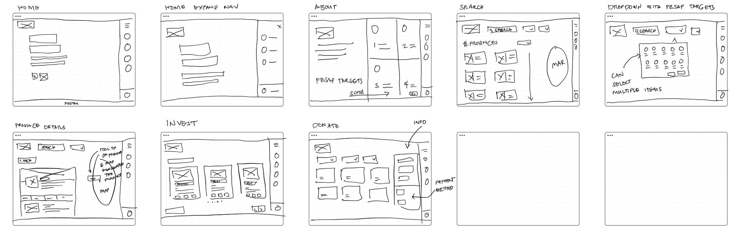
Card-based layout
Breaks down complex information into digestible sections.
Visual hierarchy
Important content and actions are emphasized for quick decisions.
Progressive disclosure
Detailed information appears only when users need it.
Consistent navigation
A persistent sidebar provides quick access across all pages.
Trust & transparency
Clear data presentation builds confidence and credibility.
Accessible experience
High contrast, readable typography and simple interactions.
Product screens — final design
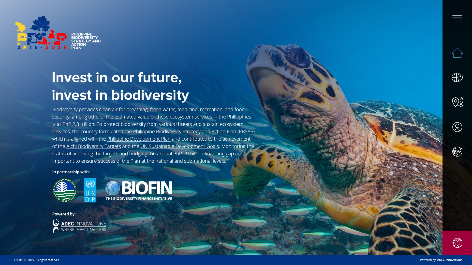
Landing Page
Introduces the platform, mission, and key biodiversity initiatives.
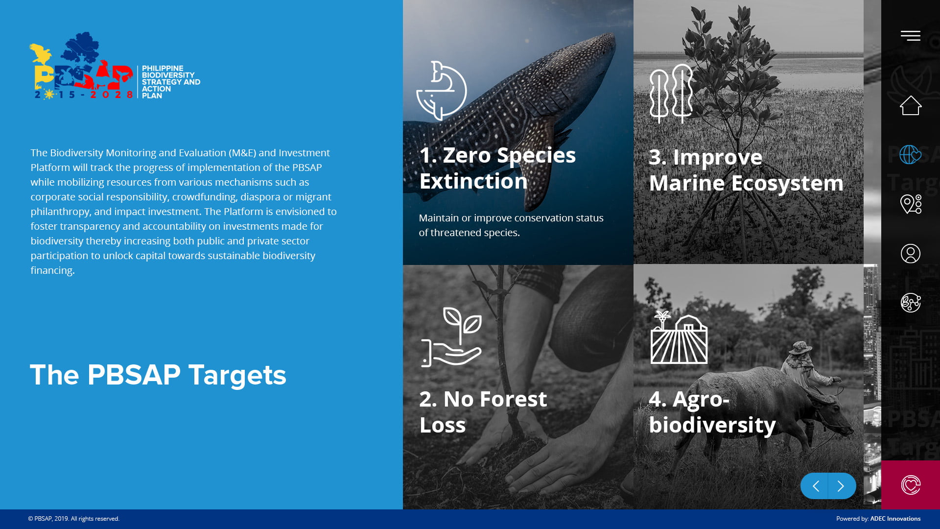
Targets
Presents the PBSAP targets with clear visual hierarchy.
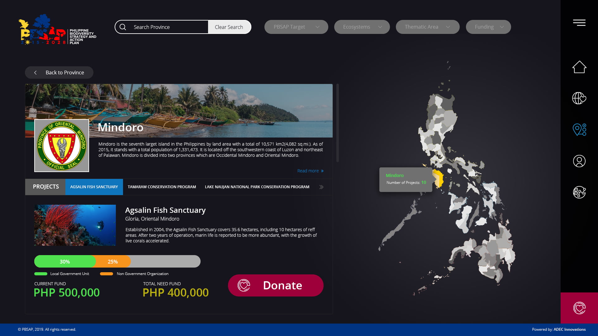
Project Details
Detailed project information, impact metrics and location.
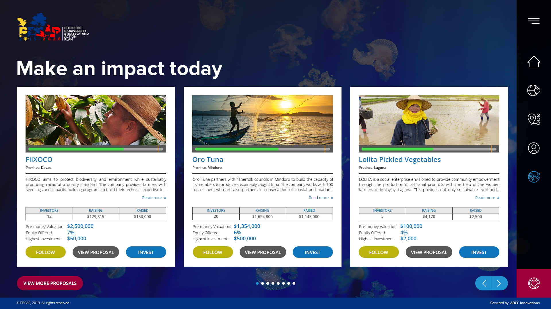
Get Involved
Encourages users to take action and support projects.
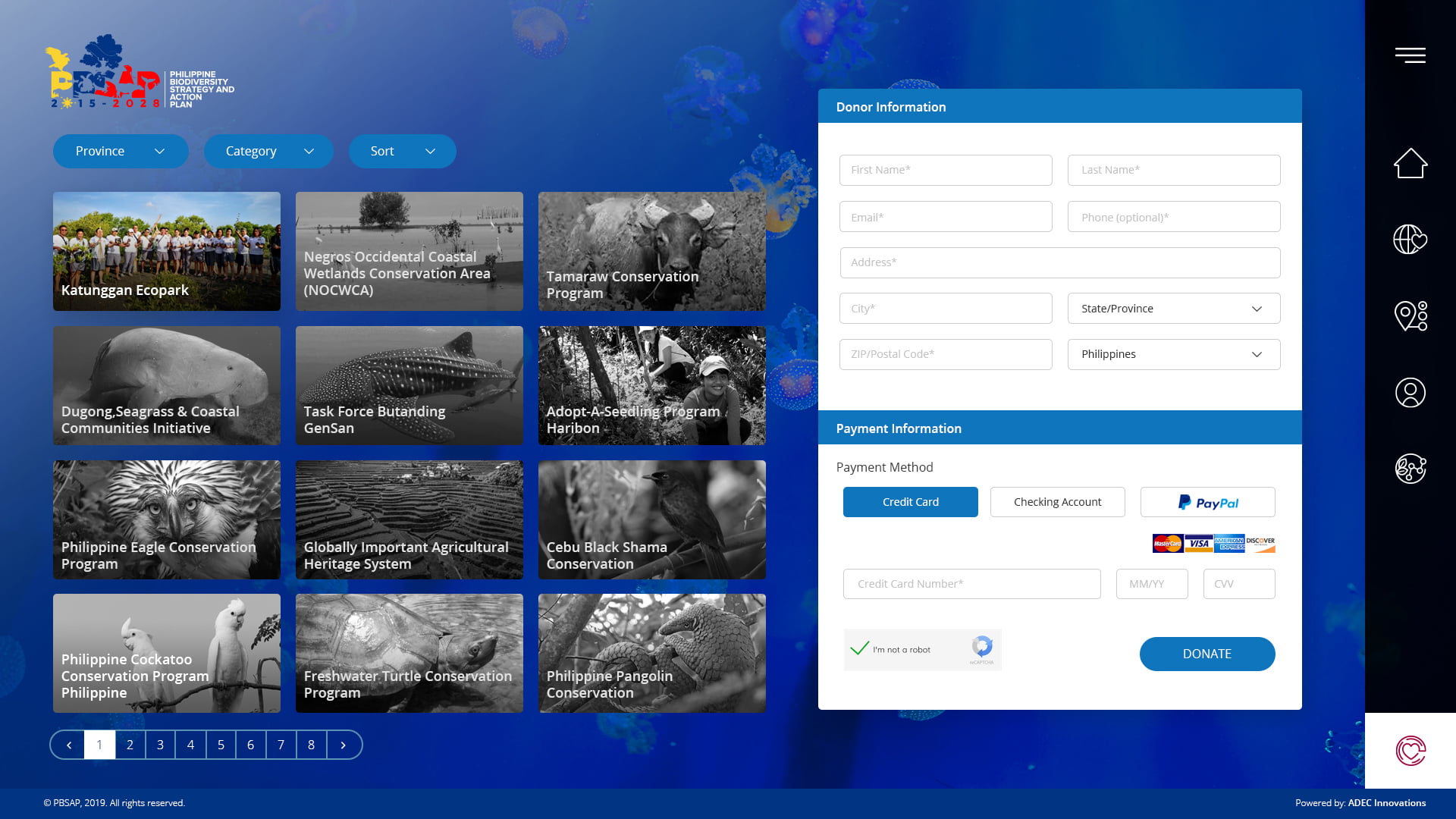
Join / Donate
Simple and secure process to join and participate.
Results and what I'd do differently
Results & outcomes
- Simplified navigation and improved content discoverability
- Organized complex information into scannable layouts
- Created reusable components and a design system
- More consistent and cohesive experience across pages
- Facilitates better understanding and decision making
This project highlighted the importance of balancing visual design with strong information architecture. Organizing complex environmental and investment information was as important as creating an engaging interface.
If I were to revisit this project, I would conduct usability testing with real investors and stakeholders to validate navigation flows and content organization.
Other projects
Like what you saw?
I'm always open to new opportunities and exciting collaborations.