Ascentify
Designer
A web-based internal platform designed to simplify configuration and workflow management through a more structured and user-friendly experience.
The problem, the goal, and what success looks like
Users had difficulty navigating existing workflows because actions were spread across multiple screens, creating confusion and increasing completion time.
Create a more organized and intuitive interface that reduces friction and makes task completion easier.
Success criteria
- Reduced navigation complexity
- Fewer repeated actions
- Better organization of information
- Improved usability feedback from stakeholders
Two roles, one shared frustration
Both groups relied on the platform daily — but scattered actions and inconsistent patterns slowed everyone down.
Operations Staff
- Use the platform frequently throughout the day
- Need quick access to information
- Prefer predictable workflows
Administrators
- Manage configurations and settings
- Handle larger amounts of data
- Need efficiency and accuracy
Users' goals
Users' pain points
Old design — key issues
- Important actions were difficult to locate
- Similar functions appeared in different locations
- Screen hierarchy was unclear
- Multiple steps increased cognitive load
- Large amounts of information made scanning difficult
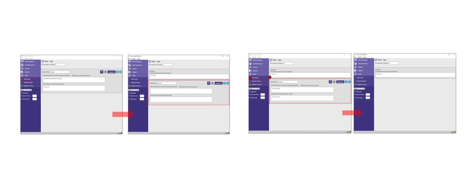
A user-centered approach to simplify workflows
Four stages across four weeks — focused on structure before visuals.
Understand
- Reviewed current screens and flows
- Identified friction points and user pain points
Define
- Simplified navigation
- Reduced unnecessary interactions
- Improved content organization
Create
- Built wireframes
- Explored layout options and interactions
- Tested different flows
Refine & Validate
- Gathered stakeholder feedback
- Updated designs based on findings
Key decisions and the final screens
Simplified navigation
Related functions were grouped together to reduce searching time.
Improved visual hierarchy
Information reorganized to help users scan and focus on what matters.
Consistent interaction patterns
Similar actions behave the same way to build familiarity and trust.
Reduced modal dependency
Minimized interruptions from unnecessary pop-ups and confirmations.
Product screens — new design
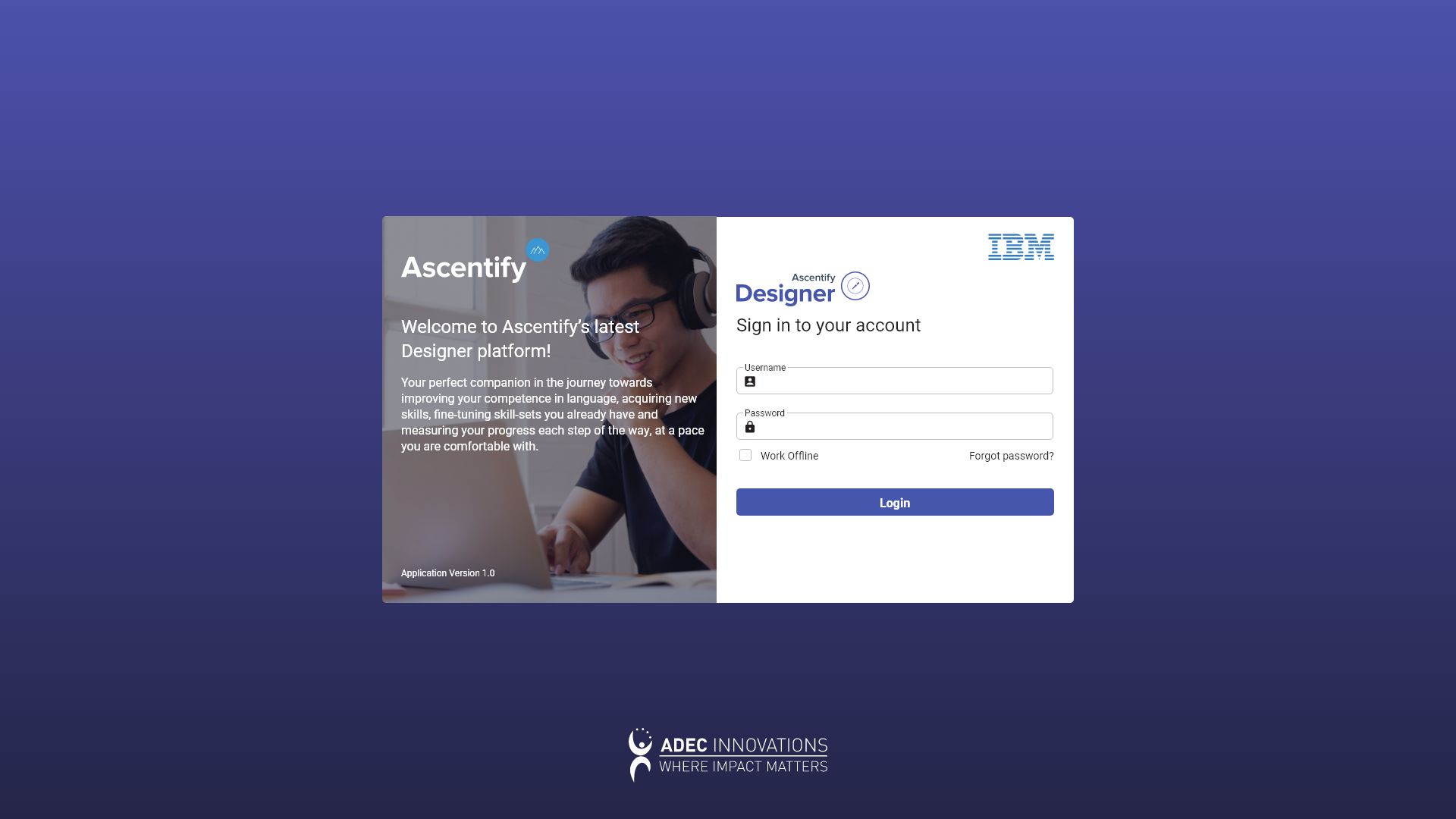
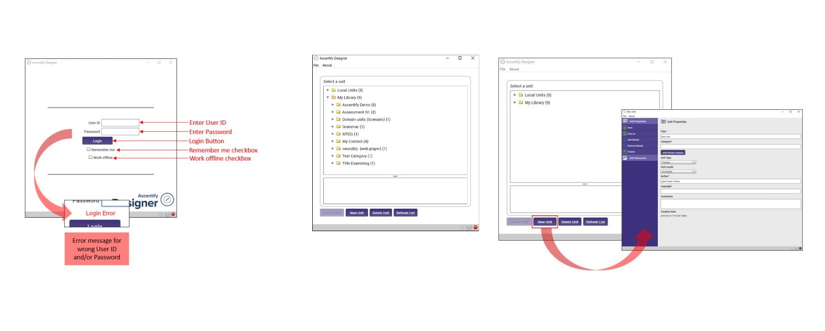
Login
Cleaner authentication flow with a stronger visual hierarchy and focus.
Dashboard
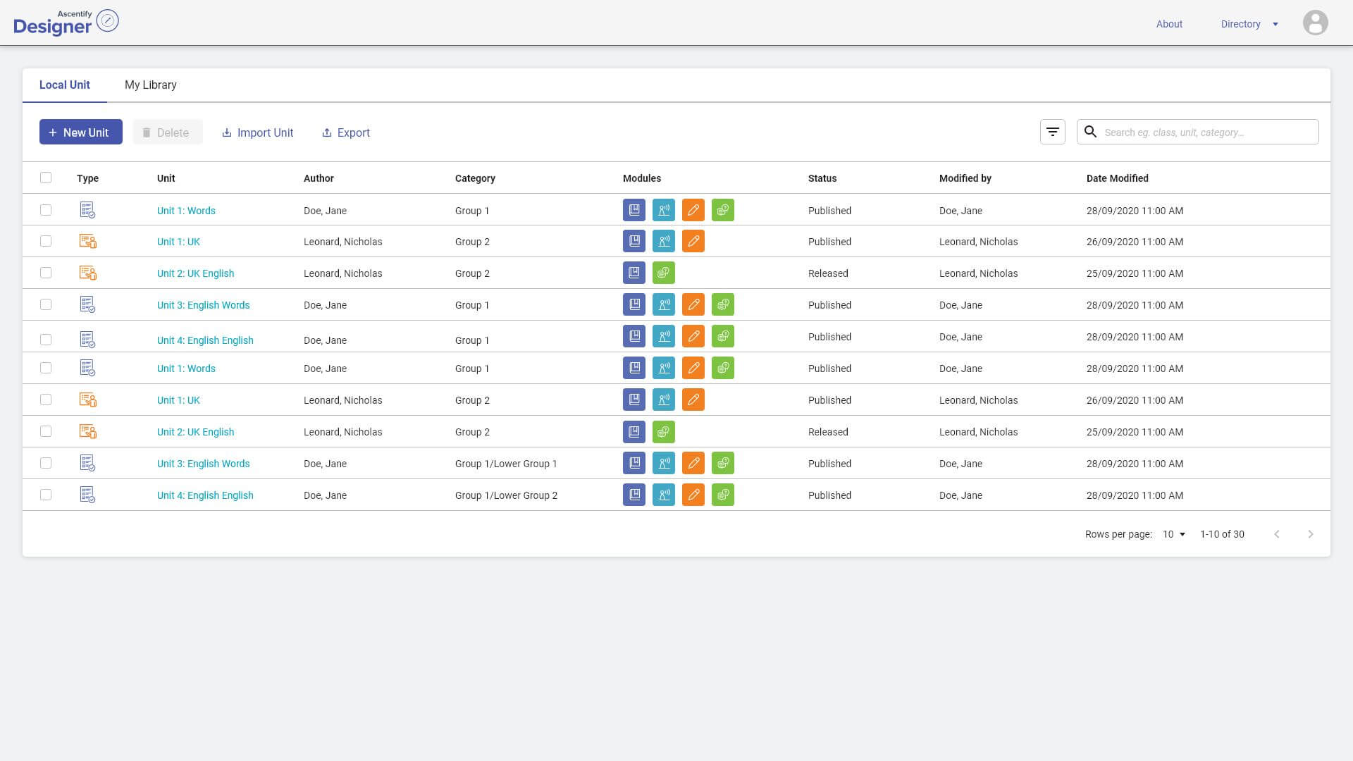
Organized key information and actions for quick overview and access.
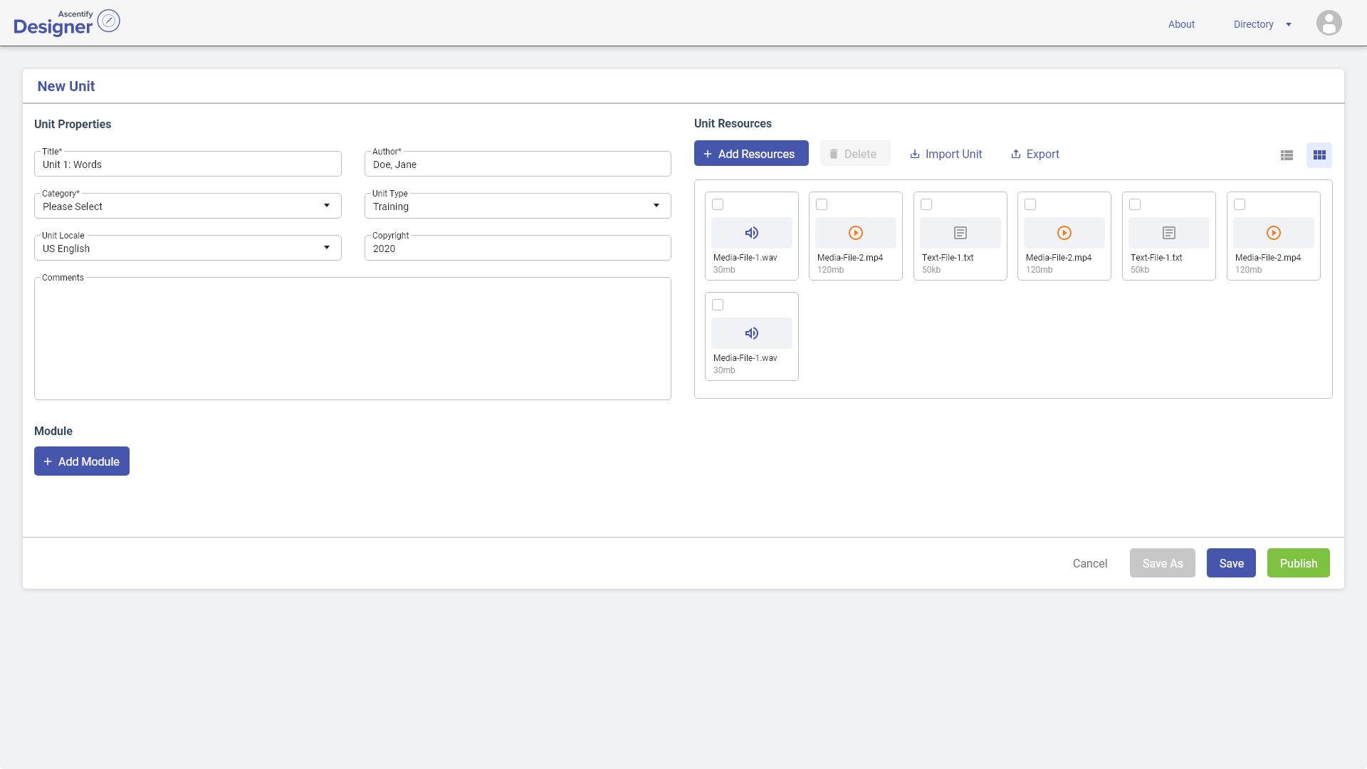
New Unit Creation
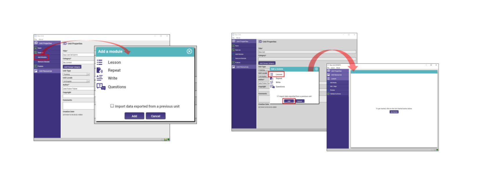
Create a training unit by entering its details, managing resources, adding modules, and saving or publishing it.
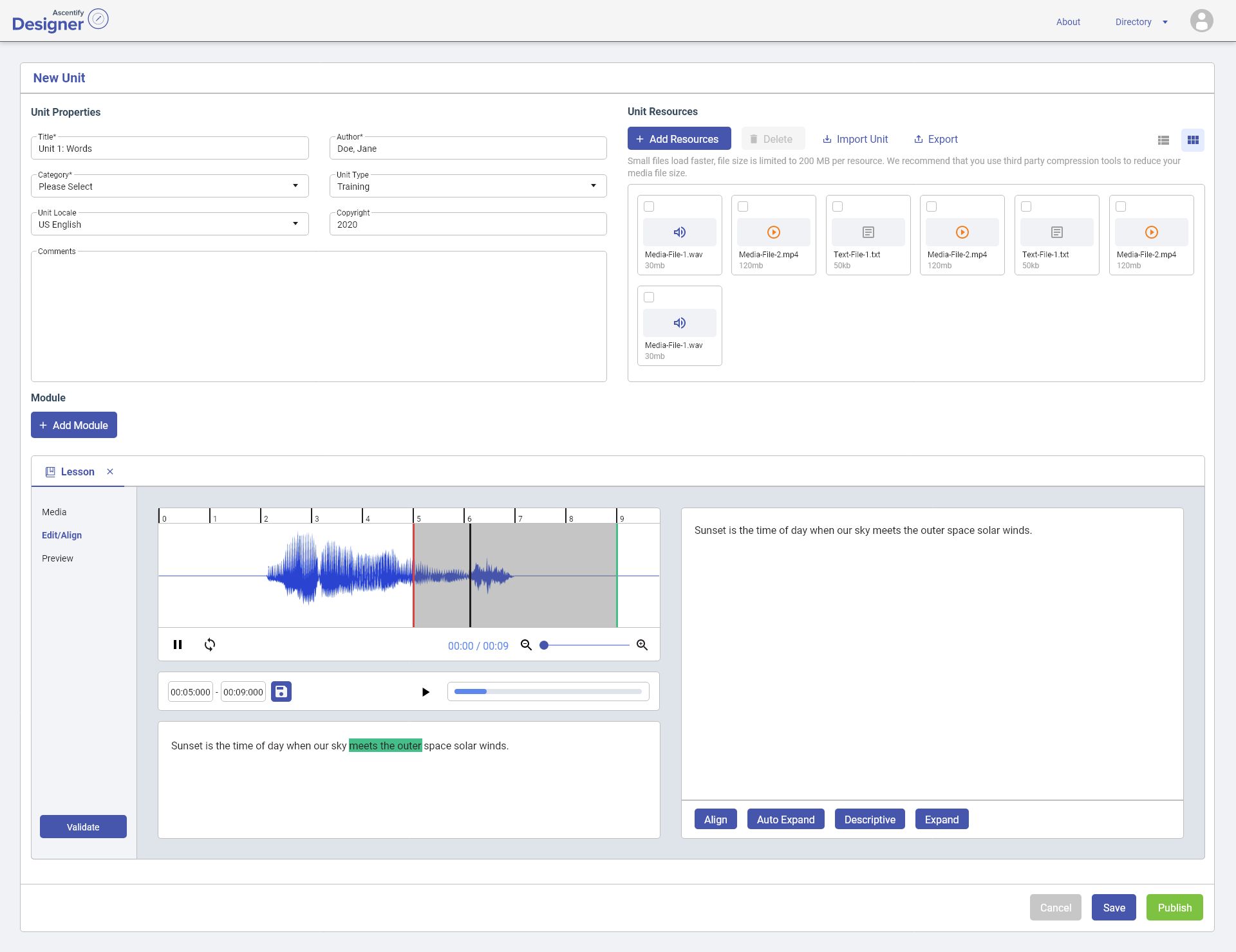
Lesson Module
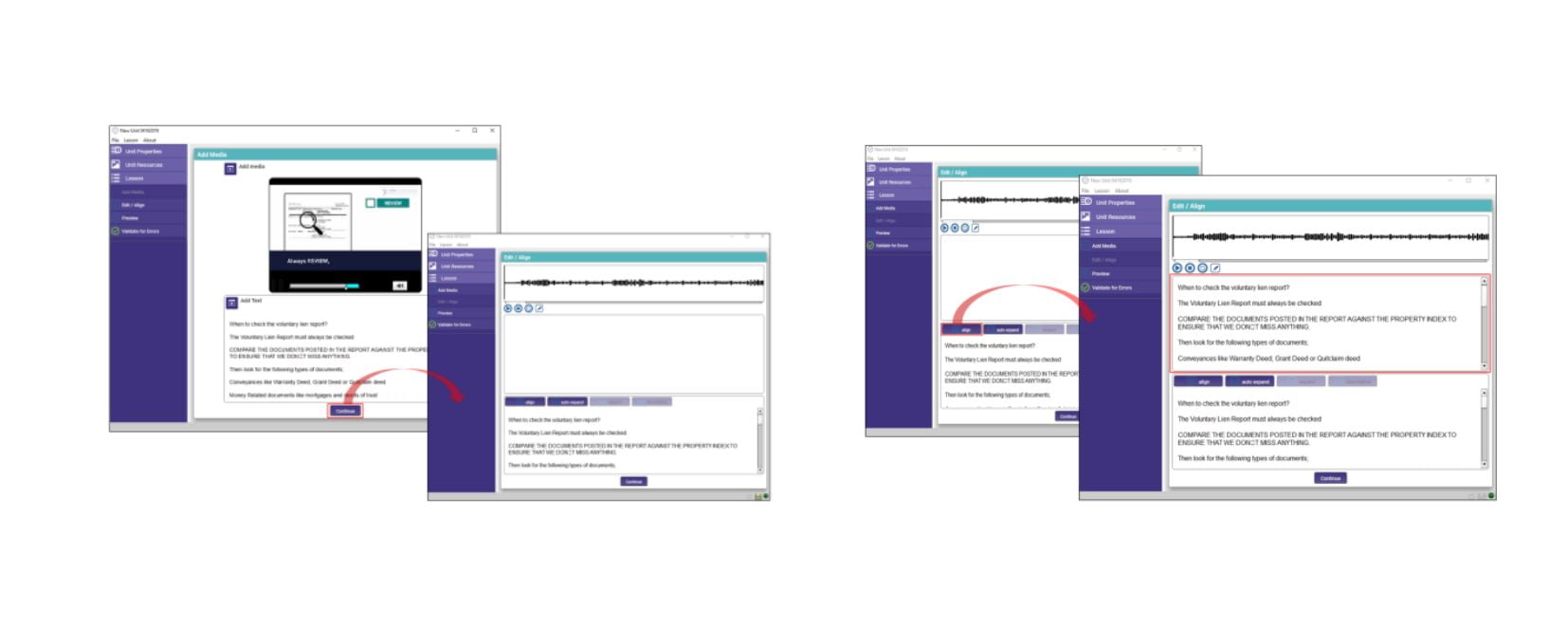
Synchronize audio with text, edit transcript timing, validate alignment, and preview the lesson before publishing.
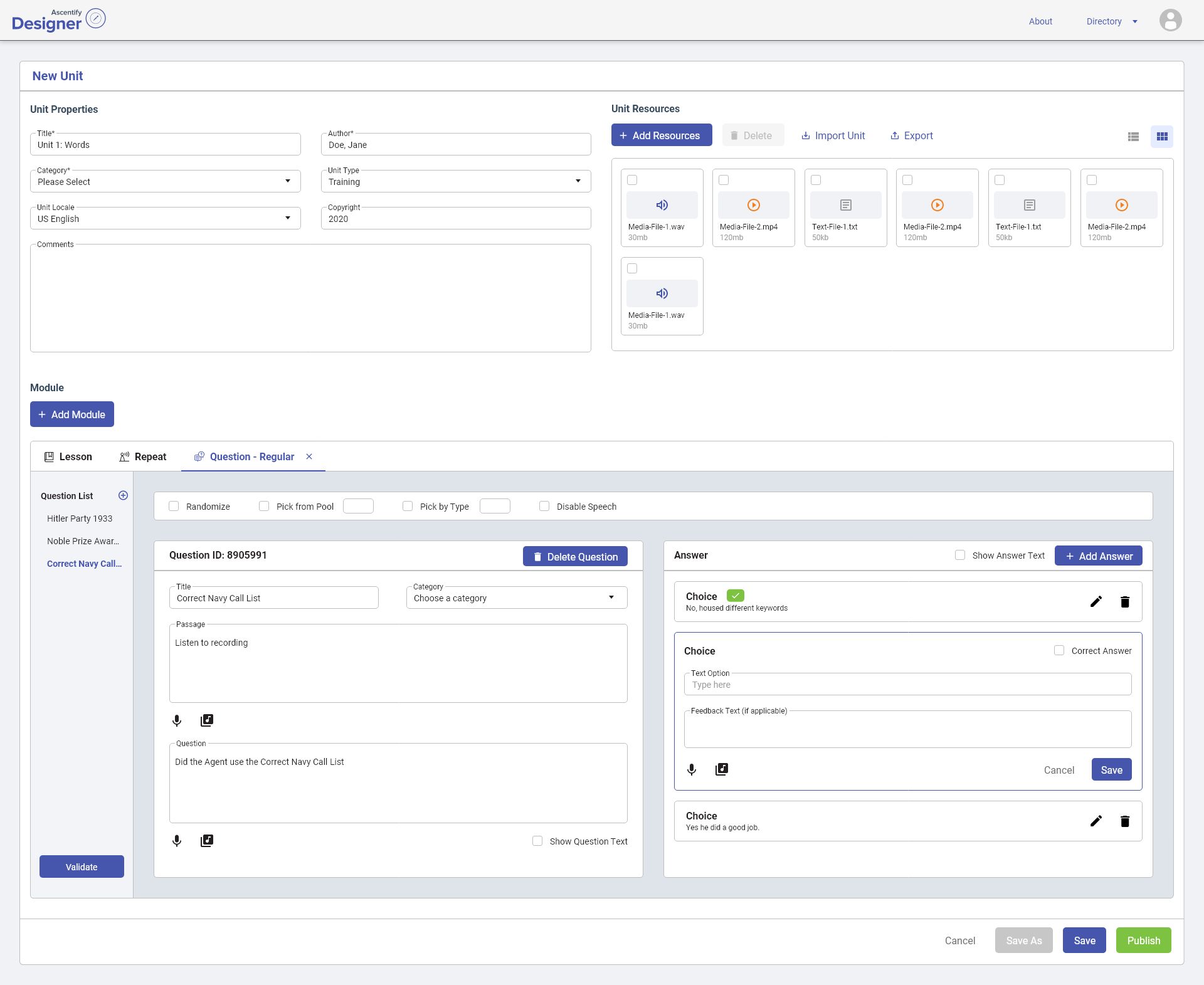
Question Module
Sets up unit metadata, uploads media/text resources, and builds a training question module.
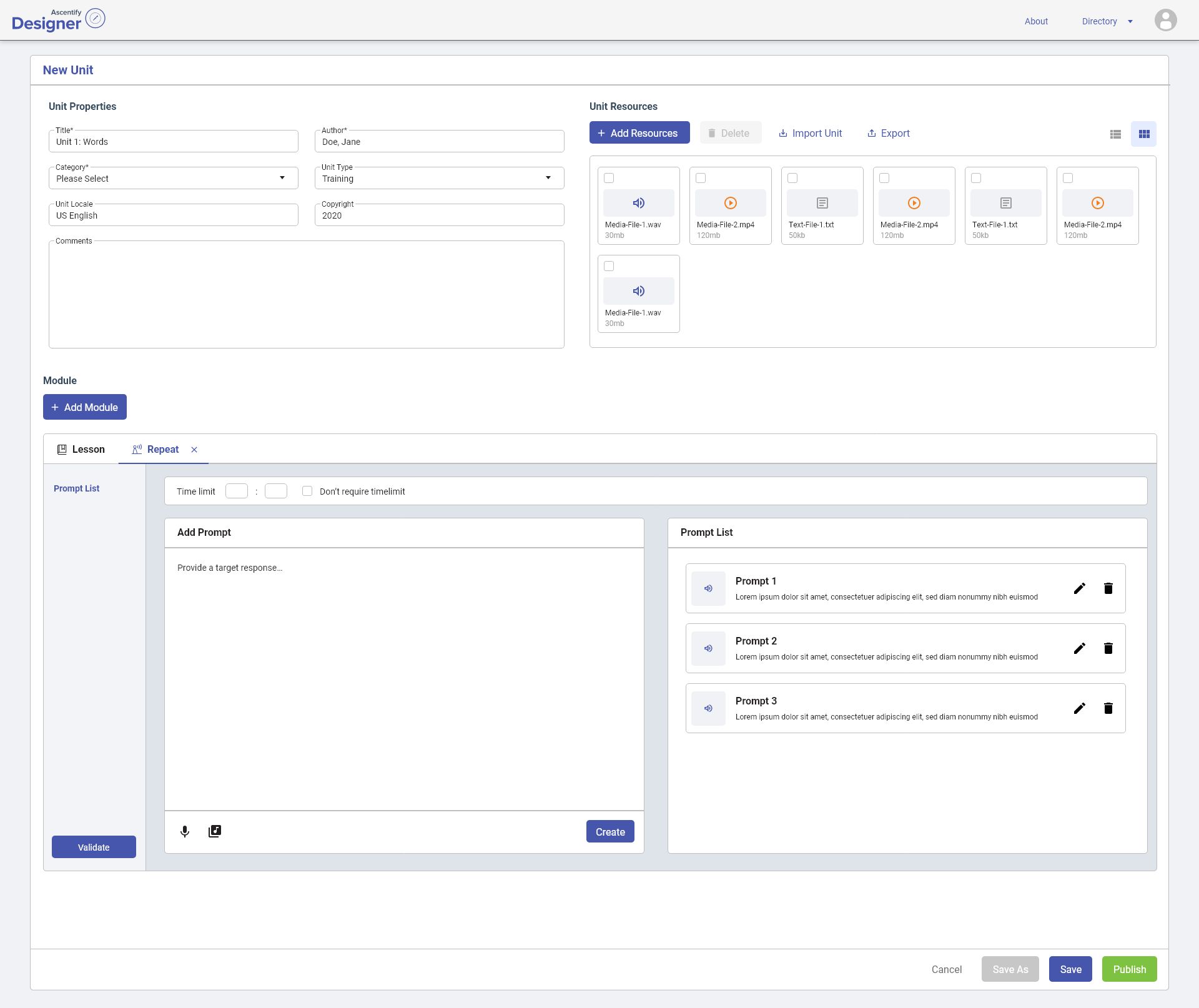
Repeat Module
Sets an optional time limit and adds/manages repeat-after-me prompts for a training unit.
Results and what I'd do differently
Results & outcomes
- Reduced unnecessary navigation steps across workflows
- Improved organization of complex information
- Created a more consistent experience across screens
- Simplified workflows for daily tasks
- Delivered reusable UI patterns for future development
This project reinforced the importance of simplifying complex workflows before focusing on visual design. Small structural changes, such as improving hierarchy and grouping related actions, had a larger impact than purely visual adjustments.
If revisiting this project, I would involve users earlier in the process and conduct usability testing to validate assumptions.
Other projects
Like what you saw?
I'm always open to new opportunities and exciting collaborations.