Ascentify Designer
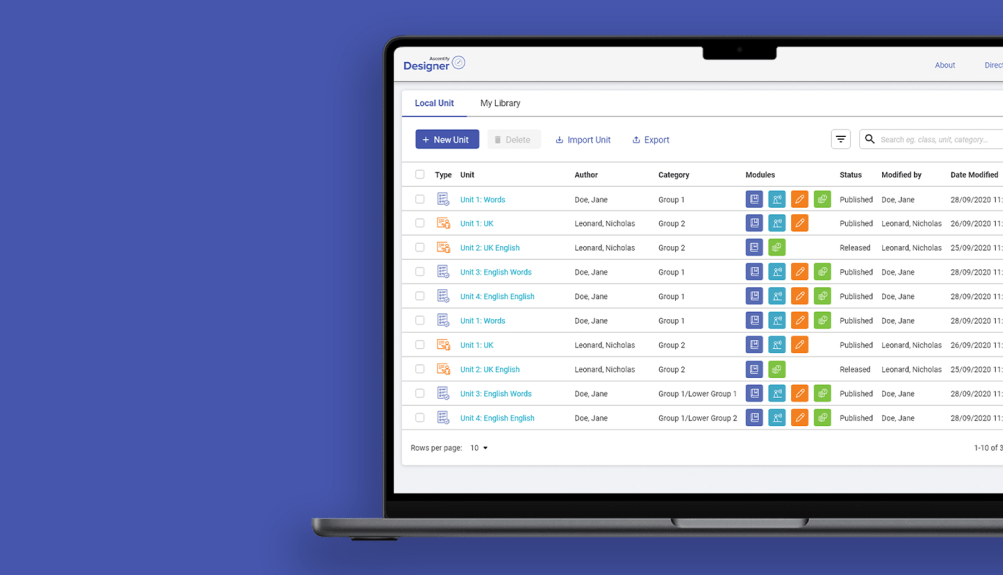
The goal of this project was to reimagine the Ascentify Designer application, turning it into a more engaging, intuitive, and effective learning platform. Our focus was on enhancing both the user interface (UI) and user experience (UX) to create a smoother, more enjoyable experience for users.
We streamlined navigation to make features easier to find and use—reducing the learning curve and helping users work more efficiently. On the visual side, we introduced a cleaner, more modern aesthetic that not only looks better but also supports clearer interaction and usability.
These improvements weren’t just about looks—they were designed to boost how users engage with the content, ultimately supporting better learning outcomes. By creating a more user-friendly and visually appealing experience, we aimed to help users interact more naturally with the platform and retain information more effectively.
In short, this project was about transforming Ascentify Designer into a smarter, more user-focused tool that actively supports users on their learning journey.
Project Overview
As the UI/UX designer on this project, I was responsible for reimagining the app’s interface and overall user experience. My focus was on improving navigation and creating a smoother, more intuitive flow for users. Over the course of 2–3 months, I worked on designing and refining the structure to ensure the experience felt cohesive, user-friendly, and aligned with the project goals.
The main goal of my work on this project was to elevate the user interface (UI) and user experience (UX) by improving the overall look, feel, and navigation of the app. This meant reworking the layout, streamlining functionality, and enhancing the visual design to create a more intuitive, engaging, and user-friendly experience.
Old Design
Here’s a look at the original version of the app. The interface was built on an outdated design style, with a layout and navigation system that made it harder for users to find what they needed. The overall experience felt cluttered and unintuitive, which created friction in the learning flow.
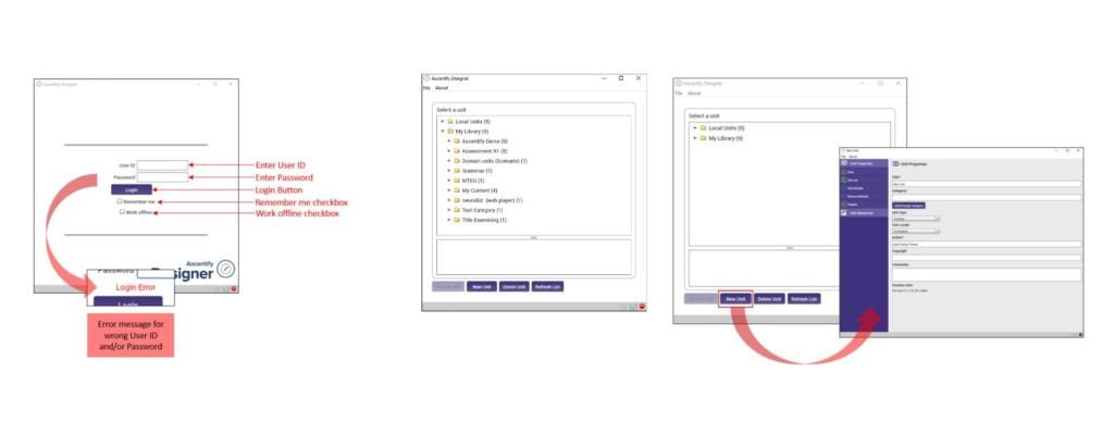
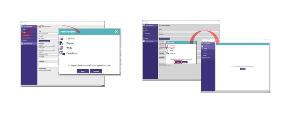
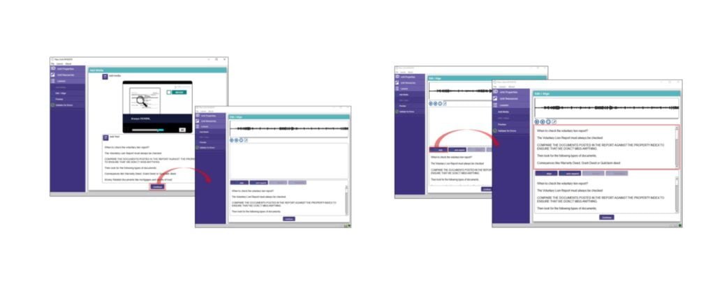
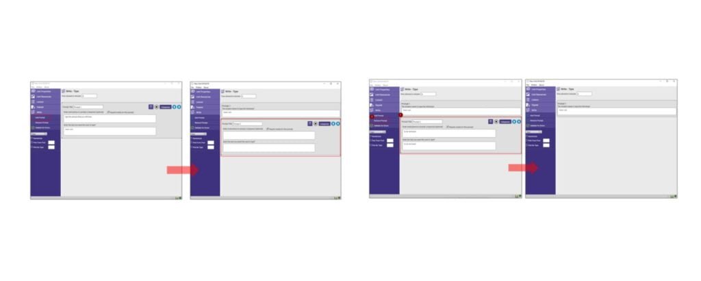
Process
I built upon the existing design as a foundation, using its core elements to create a more user-friendly interface. By enhancing the layout and navigation, I was able to maintain consistency while introducing improvements to simplify the user experience. The final design strikes a balance between familiarity and innovation, making it both intuitive and efficient for users to navigate.
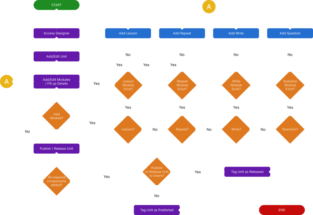
This is the high-level process flow for the app.
Product Screens
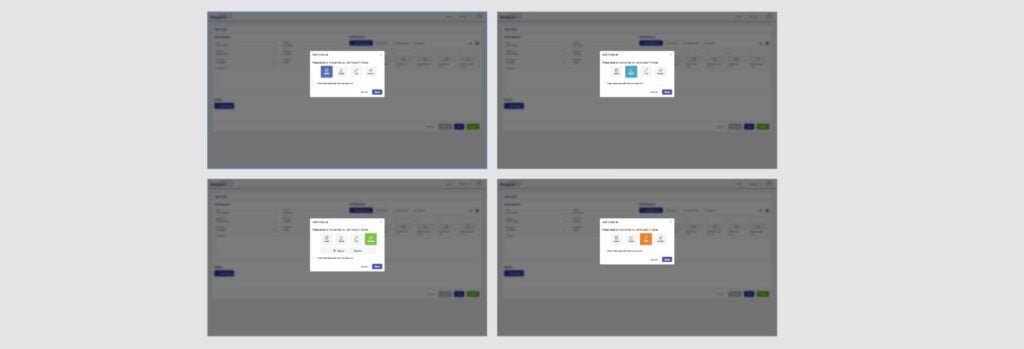
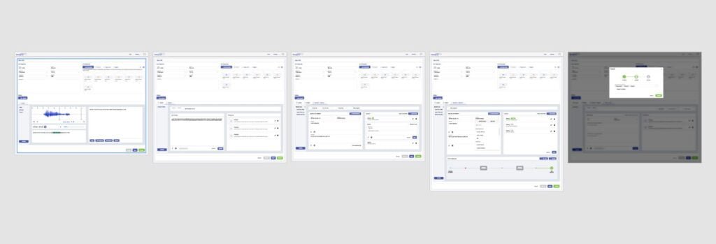
These screens are now live, showcasing our commitment to delivering a user-friendly interface that exceeds expectations. The design improvements prioritize usability, accessibility, and aesthetics, ensuring a seamless, intuitive, and enjoyable experience for all users.
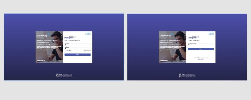
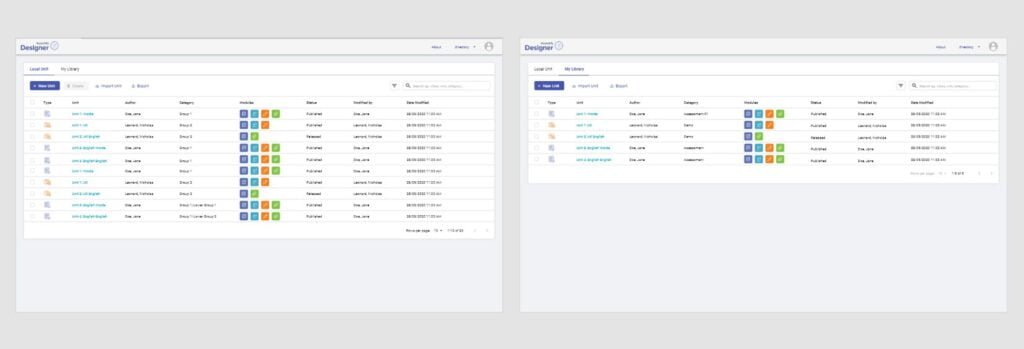
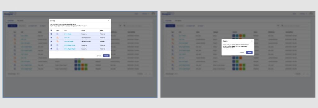
Results
After months of collaboration with the Ascentify team—developers, project managers, and clients—the design was finalized and approved for development.
Throughout the development phase, I stayed involved, offering layout feedback and recommending adjustments to ensure everything stayed on track and aligned with the design vision.
Once the project launched, Ascentify adopted the new interface, and we continue to roll out improvements and UI updates to enhance the app further
Reflections
While the initial launch of Ascentify Designer has been completed, there are still plenty of opportunities for further improvement. New ideas and enhancements surfaced during development, and the project remains ongoing with future phases in the works.
For more updates and information, visit the Ascentify website.
